Your website navigation menu is the first thing visitors reach for when they land on your site. Get it wrong and people leave. Get it right and they stick around, explore, and eventually get in touch.
The problem? Most business owners never think twice about it. They pick a menu because it looked nice in a template. Or because it was the default. Or because someone said it was “standard.”
That is not good enough. Your navigation is doing a job. It should do that job well.
This guide covers the main types of website navigation menus, what each one is actually good for, and how to figure out which one belongs on your website.
Why your navigation menu matters more than you think
Visitors scan your navigation within the first few seconds of landing on your site. If they cannot figure out where to go, they bounce. That is a lost lead. Possibly forever.
Research from Nielsen Norman Group found that hidden navigation menus make navigation 15% slower and increase perceived difficulty by 21%. That 21% is not a rounding error. It is real people giving up and going somewhere else.
Your navigation is not decoration. It is a conversion tool. Treat it like one.
The main types of website navigation menus
1. Horizontal top navigation bar
This is the one you see on most service business websites. Links sit across the top of the page in a single row. Home. About. Services. Blog. Contact.
It is familiar, clean, and visible. Visitors know exactly what it is and how to use it.
Best for: Service businesses, consultants, local trades, professional firms. Any site with five to seven main pages.
The upside: Visibility. Every option is right there, no clicking required. Visible navigation increases click-through to key pages and gives visitors a clear mental map of your site the moment they arrive.
The downside: It has a limit. Pack in too many links and it falls apart. Keep it to seven items maximum. If you have more pages than that, use dropdowns or rethink your site structure.

2. Dropdown navigation menu
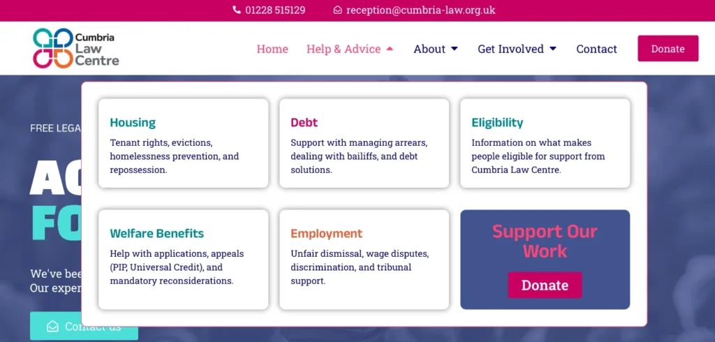
A dropdown expands when you hover over or click a top-level menu item. It reveals a list of sub-pages underneath.
Services. Click. Web design. SEO. Digital support. Done.
Best for: Businesses with a clear range of services or a site with eight to twenty pages that need grouping. Think solicitors with multiple practice areas, or agencies with several distinct offerings.
The upside: Organisation. It keeps your top-level nav clean while giving visitors access to deeper pages. Good for SEO too, as it helps search engines understand your site structure.
The downside: Hover-only dropdowns can be a nightmare on mobile and for keyboard users. Build yours to work on click, not just hover. And do not go more than two levels deep. Nobody wants to navigate a menu that has menus inside menus.

3. Mega menu
A mega menu drops down a large panel of content, often spanning multiple columns. Think large ecommerce sites or complex organisations with dozens of categories.
Best for: Ecommerce stores, universities, large service directories. Not a typical fit for SMBs.
The upside: You can show a lot of content at once, including images, featured links, or calls to action within the menu itself.
The downside: For most small and medium business websites, this is overkill. It adds visual weight and complexity your visitors did not ask for. If you are running a five-page service site, a mega menu is a sledgehammer where you need a screwdriver.

4. Hamburger menu
Three horizontal lines. A stack. A burger. Whatever you call it, everyone knows the icon.
Tap it. The menu slides out or expands. Tap it again. It closes.
Best for: Mobile-first sites, apps, and visual portfolios where screen space is precious and the primary conversion does not live inside the menu.
The upside: It keeps the page clean. On a mobile screen, it removes a navigation bar that would otherwise eat up a chunk of valuable real estate above the fold.
The downside: It hides your navigation. And hidden navigation gets used less. Studies consistently show that hamburger menus reduce discoverability, slow down navigation, and hurt conversion rates on service business websites.
If your contact page, booking page, or key service pages are buried inside a hamburger menu on desktop, you are making visitors work harder than they should have to.
The fix? Use it on mobile where it makes sense. On desktop, stick to a visible navigation bar. And if you are going to use a hamburger icon, labelling it “MENU” increases clicks by around 20% compared to the three-line icon alone.

5. Vertical sidebar navigation
Navigation runs down the left or right side of the screen rather than across the top. Less common on business websites, more common in dashboards and web applications.
Best for: Dashboards, SaaS products, portals with complex navigation structures.
The upside: More room for navigation items than a horizontal bar. Works well when the primary content needs the full horizontal width of the screen.
The downside: Feels unfamiliar on a standard marketing or service website. Visitors expect the nav at the top. Putting it on the side without a good reason adds a subtle friction most people do not notice consciously, but definitely feel.

6. Sticky (fixed) navigation
This is not a menu type on its own. It is a behaviour. A sticky navigation stays fixed at the top of the page as the visitor scrolls down.
Best for: Any site with long-form content or long pages. Service pages. Blog posts. Landing pages.
The upside: Your navigation, and more importantly your key calls to action, stay visible at all times. The visitor does not have to scroll back to the top to take the next step. That is a conversion win.
The downside: On mobile, a sticky nav bar eats into limited screen space. Keep it slim. Some sites make the sticky version a condensed version of the full menu, which is a sensible middle ground.

7. Footer navigation
The navigation at the bottom of the page. Often overlooked. Should not be.
Best for: Every website, as a secondary layer.
Visitors who scroll to the bottom of your page are engaged. They read what you wrote. They want more. A solid footer navigation gives them somewhere to go: legal pages, contact details, secondary service pages, social links.
It is not a replacement for your main navigation. It is a backup. Use it.

8. Anchor (same-page) navigation
Links that jump to sections within the same page rather than loading a new one. Common on single-page websites and long-form landing pages.
Best for: One-page websites, product landing pages, long service pages with multiple sections.
The upside: Keeps the user on one page and guides them through a specific flow. Useful when you want to control the journey rather than let visitors wander.
The downside: Can confuse users who expect links to load new pages. Works best when the experience is designed specifically around it from the start, not bolted onto a site built for traditional navigation.
How to choose the right navigation for your website
Here is a straightforward way to think about it.
How many pages do you have?
Five to seven pages: horizontal top nav. Eight to twenty pages with clear groupings: add dropdowns. Fewer than five pages: keep it minimal.
What is your primary conversion action?
Whatever that is, get in touch, book a call, request a quote, it should be visible in your navigation. Not hidden inside a hamburger. Not buried in a dropdown. Right there, at the top, ideally as a button.
What device do your visitors use?
Check your Google Analytics. If more than 60% of your visitors are on mobile, your navigation decisions need to be mobile-first. That might mean a hamburger menu on mobile with a full nav on desktop. Most modern websites do exactly this.
Does your navigation match what visitors are looking for?
Your nav labels should match the language your customers use. Not the language your business uses internally. If people search for “web designer in Carlisle” and your nav says “creative solutions,” that is a mismatch. Call things what they are.
Hamburger menu vs top navigation: which one converts better?
For business websites on desktop, the research is pretty clear. Visible top navigation outperforms a hamburger menu for conversions.
A standard horizontal menu can increase conversion by up to 150% compared to a hidden hamburger menu in A/B tests. That is not a small margin.
The reason is simple. When people can see their options, they are more likely to explore them. When they have to go looking for the menu first, a portion of them will not bother.
That said, the hamburger menu is not always wrong. On mobile, where screen space is limited and the design is intentionally linear, a well-built hamburger works fine. The key word is well-built.
The hybrid approach is usually the answer: full visible navigation on desktop, hamburger on mobile. Most small business websites should be built this way by default.
Sticky navigation: worth it or not?
Yes. For most service business websites, a sticky navigation menu is worth including.
The reason: long pages need it. If someone is reading a 1,500-word service page and decides they want to get in touch, they should not have to scroll back to the top. A sticky nav keeps your contact link within reach at all times.
What to watch out for on mobile: a sticky bar that is too tall eats into your content space. Keep it compact. A slim sticky bar with your logo and a single CTA button is often enough.
Common navigation mistakes to avoid
Too many links. Every link you add is another decision your visitor has to make. Fewer choices, clearer paths. Aim for five to seven items maximum in your main navigation.
Vague labels. “Solutions,” “resources,” “offerings,” these mean nothing to a visitor who has not read your entire site. Use plain language. Services. About. Blog. Contact. Job done.
No clear call to action. Your navigation should include a clear next step, usually a button. Make it stand out. Do not let it blend into the other links.
Ignoring mobile. Over half of web traffic is on mobile devices. If your navigation is broken or confusing on a phone, you are losing leads every single day.
Hiding important pages. Your most important pages should be one click away from anywhere on your site. If visitors have to hunt for your contact page, they will not.
Frequently asked questions
What is the most common type of website navigation menu?
The horizontal top navigation bar is the most widely used. It is familiar, accessible, and works well for the majority of business websites. Visitors know how to use it without thinking.
Should a small business website use a hamburger menu?
On desktop, probably not. A hamburger menu hides your navigation, which tends to reduce clicks to your key pages. On mobile, a well-designed hamburger menu is a sensible and standard choice.
How many items should be in a website navigation menu?
Five to seven items is the sweet spot. Fewer than five and you might be missing important pages. More than seven and you risk overwhelming visitors with choices.
What type of navigation is best for converting visitors into leads?
A visible, horizontal top navigation with a clear call-to-action button. Sticky navigation helps too, keeping your key links in view as people scroll. Keep it simple and make the next step obvious.
What is the difference between primary and secondary navigation?
Primary navigation is your main menu: the links in the header that take visitors to your core pages. Secondary navigation is typically in the footer or sidebar, covering less critical pages like legal notices, social links, and supplementary content.
Is a sticky navigation menu good for SEO?
A sticky nav does not directly boost your search rankings, but it improves user experience. Visitors who can navigate easily are more likely to stay on your site longer and visit more pages, which are positive signals for search engines.
The short version
Your navigation is not just a menu. It is one of the biggest usability decisions on your entire website.
Get the type wrong and visitors get confused. Bury your key pages and leads disappear. Pack in too many links and the whole thing collapses.
The right navigation for most small and medium business websites is simpler than you think. A visible horizontal bar, five to seven clear links, a button for your main call to action, and a hamburger menu on mobile. That is it.
If your current navigation does not look like that, it is worth revisiting.
fecking creative builds websites that are easy to use, easy to find, and built to bring in leads. If your navigation (or anything else about your website) is getting in the way, get in touch and let’s have a look.